RoboKiller iOS

Company Teltech

Date Oct 2019 - Jan 2021

Team 1 designer (me), 2 product managers, 3 frontend developers, 2 backend developers, 1 QA

My Role UI/UX design / usability research

Tools Figma for UX design
After Effect and Lottie for animation
UserZoomGo and Typeform for usability research
Survery Monkey for marketing research

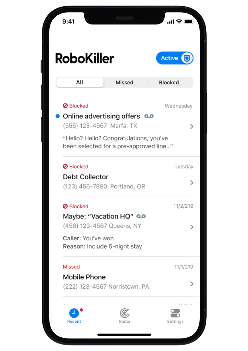
APP Overview RoboKiller is a popular spam call blocking app known for engaging spammers and telemarketers in time wasting activities with often humorous end results. During my tenure with the team, RoboKiller v5 (RK5) was released, which includes more sophisticated call blocking methods and new call screening features.

App Store Ratings 4.5 out of 5 (iOS)
As of September 2022
RoboKiller

Problem Statements 🤔

Post acquisition, my newly formed product team immediately identified several problems/challenges that we believed could be overcome with design improvements.
App UX problems
  • It is Complicated: To ensure proper setup and configuration, users must complete a long and complicated process to adjust device permissions and update carrier related call forwarding.
  • It is Variable: Users may have uniquely different experiences based on their phone carriers or iOS versions.
  • It is Wordy: RK5 usage involves industry standard nomenclature that users might not be familiar with, such as "Call Forwarding," "Neighbor Spoofing," etc.
Business Problems
  • User engagement is typically limited to first-time use as RK5’s primary function, blocking spam, tends to be a “set it and forget it” experience.
  • The previous product team was not engaged in recurring usability research or in-app surveys to evaluate UX issues within the app.

Approaches 🙋🏻‍♀️

Suggested Stakeholders Do Recurring Usability Research
  • Conducted 7 unmoderated usability research per year to validate UI improvements.
  • Identified UX issues that our core demographic (Age 50 and up) are having.
  • Conducted 3 in-app surveys per year.
  • Consucted one marketing reearch survey to evaluate new feature.
  • Went through copy on each screen and notifications, removed technical terminology that is not familier with users.
Suggested to Add “Radar” Screen to the App
  • Designed the "Radar" tab to show the product's benefits, latest updates, and promotions that used to be in other screens that make the UI cluttered. Later, the Radar screen became the place to improve user engagement.
Set Up Mid-sprint Design Reviews
  • With Product manager’s help, I set up a mid-sprint design sync with developers. Having a design review mid-sprint allows for a wider scope of revisions with 3-5 days to fix them, be aligned with developers.

Design Solution #1: Improve Call Screening Setting Page

Project Overview
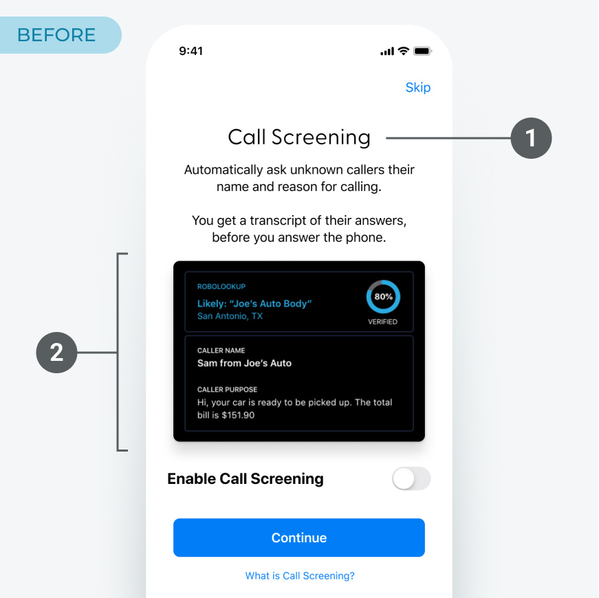
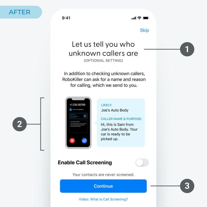
We needed to improve the messaging within the Setting screen. Call screening is the feature that RoboKiller play the recorded message to the unknown callers to ask their name and reason for calling, and the user can see before picking up the call. I conducted the usability test on onboarding flow, and several participants paused at the Call Screening setting screen below on the left.
Call Screening setting before design updates
Before
  1. Most users are not sure what “Call Screening” means.
  2. New users are not familiar with this caller screen.
  3. Usability research shows users are concerned if their contacts get screened.
Call Screening setting after design updates
After
  1. Update headline, make it clear it’s optional.
  2. Show image of the phone with example.
  3. Let users know RoboKiller is not screening their contacts.

Design Solution #2: Improve Blocking Settings Screen

Project Overview
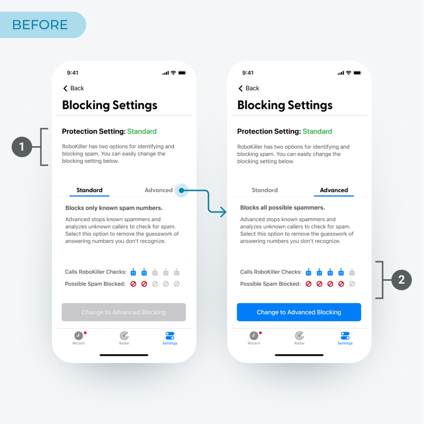
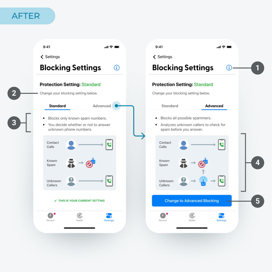
RoboKiller has two blocking settings - Advanced blocking and Standard blocking. Advanced blocking works better with call blocking, although if users expect unknown calls such as recruiters, Standard Blocking works better. Also, some users can only use Standard Blocking because of their carriers.
We need to create setting screens that inform users without using technical jargon.
Call blocking setting before design updates
Before
  1. Copy was not informative.
  2. It was n ot clear what these icons mean.
Call blocking setting after design updates
After
  1. Added link to the info page for users who want to know the details.
  2. Made the copy shorter.
  3. Added bullet points to the copy.
  4. Updated Info graphic.
  5. Removed disabled button.

Contact

Thank you for checking out my work. If you want to know more about my design process, or if you want to talk about a cool idea, don't hesitate to reach out.

Email ckobayashi54@gmail.com

Social